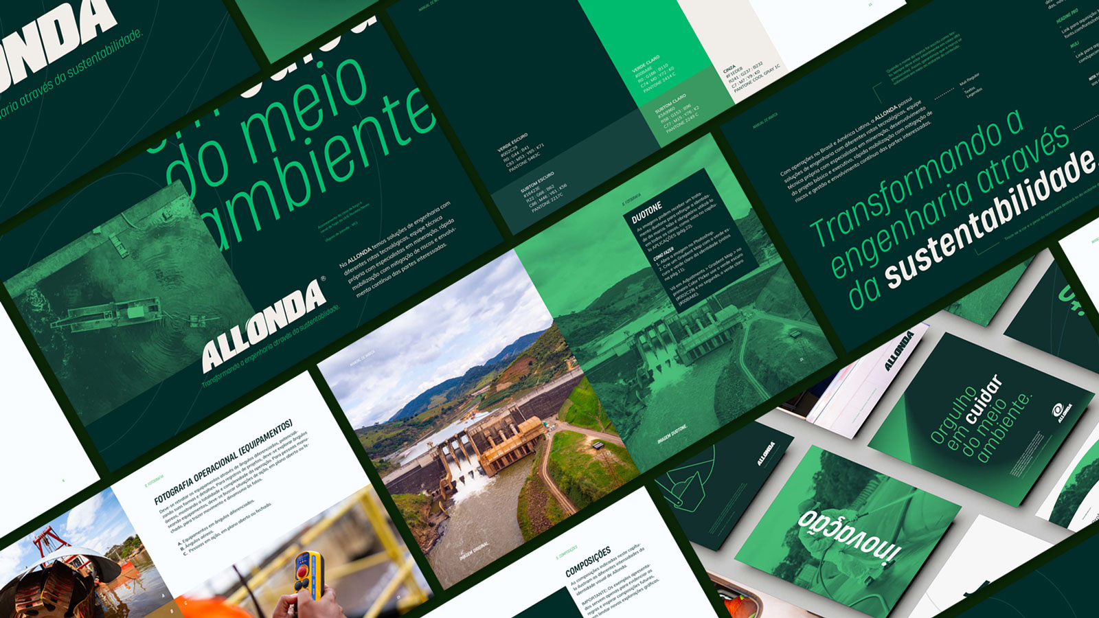
With over two decades of operations in Brazil and Latin America and a team of around 2,500 members, the holding company is formed by five companies whose mission is to transform the future through sustainability.
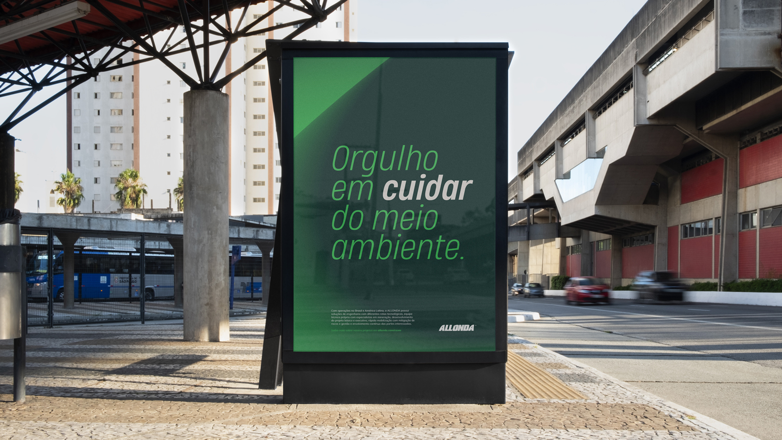
As part of a moment of evolution of the company but without changing the existing logo, that reinforces its purpose and expands the possibilities of communication. Through our investigations together with the Allonda team, we understood that the new visual language needed to be flexible, engaging, and trustworthy, celebrating the transformation and actions of the Group.
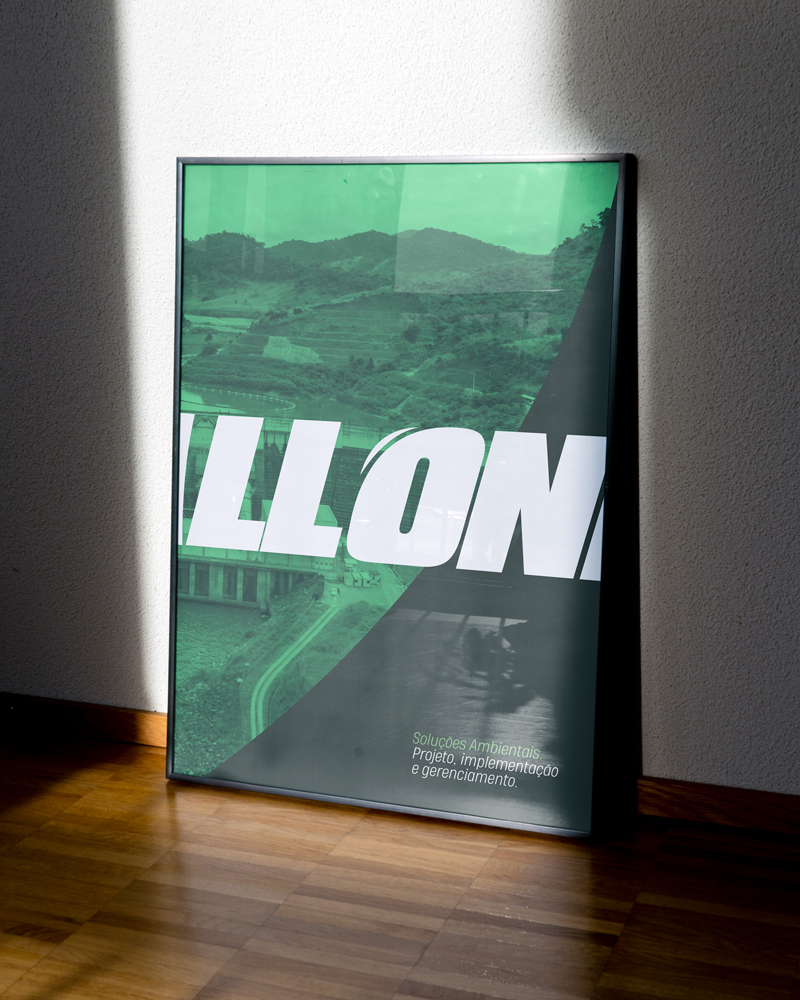
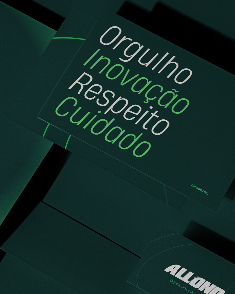
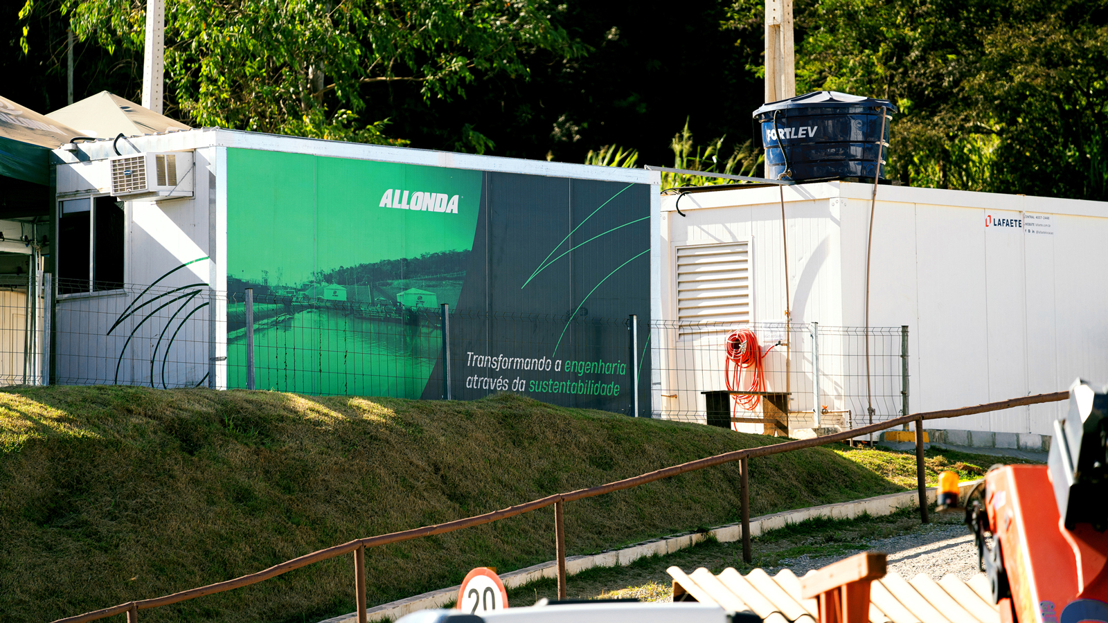
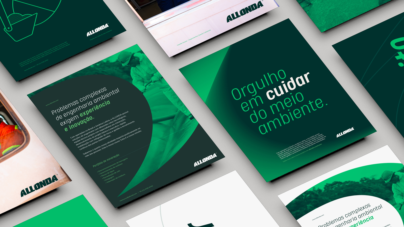
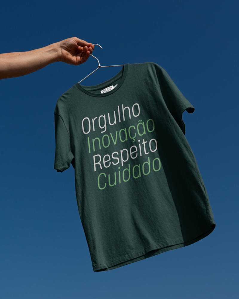
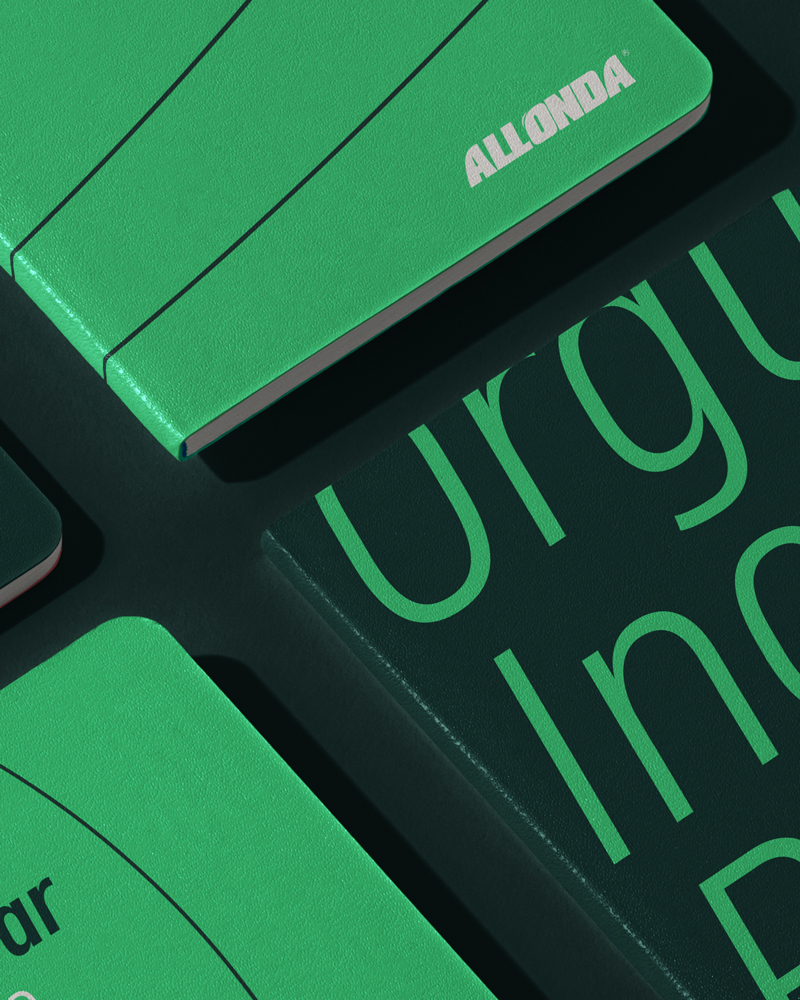
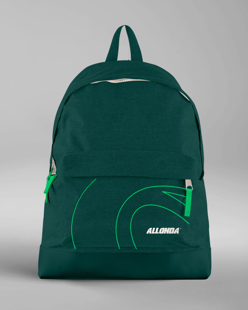
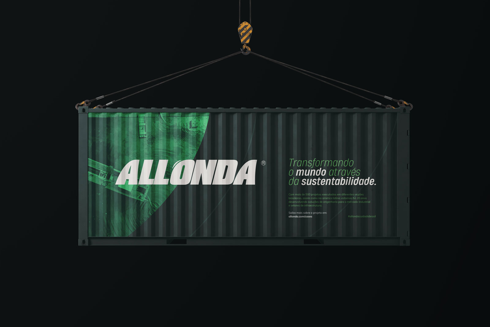
To do this, we start by reviewing their colors. We kept its essence but eliminated excesses and lit up its tones, introducing a more contemporary and vibrant palette. Then we picked a new typeface, more dynamic and robust, that relates harmoniously with the visual elements of the brand.
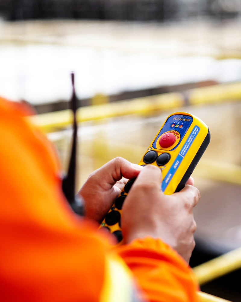
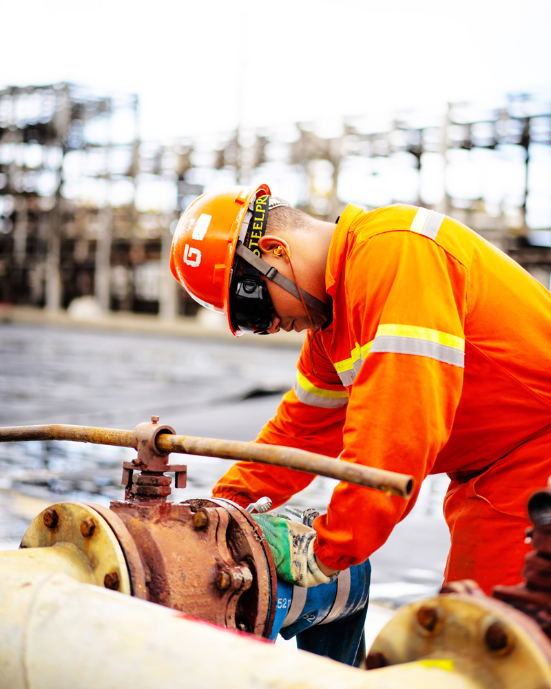
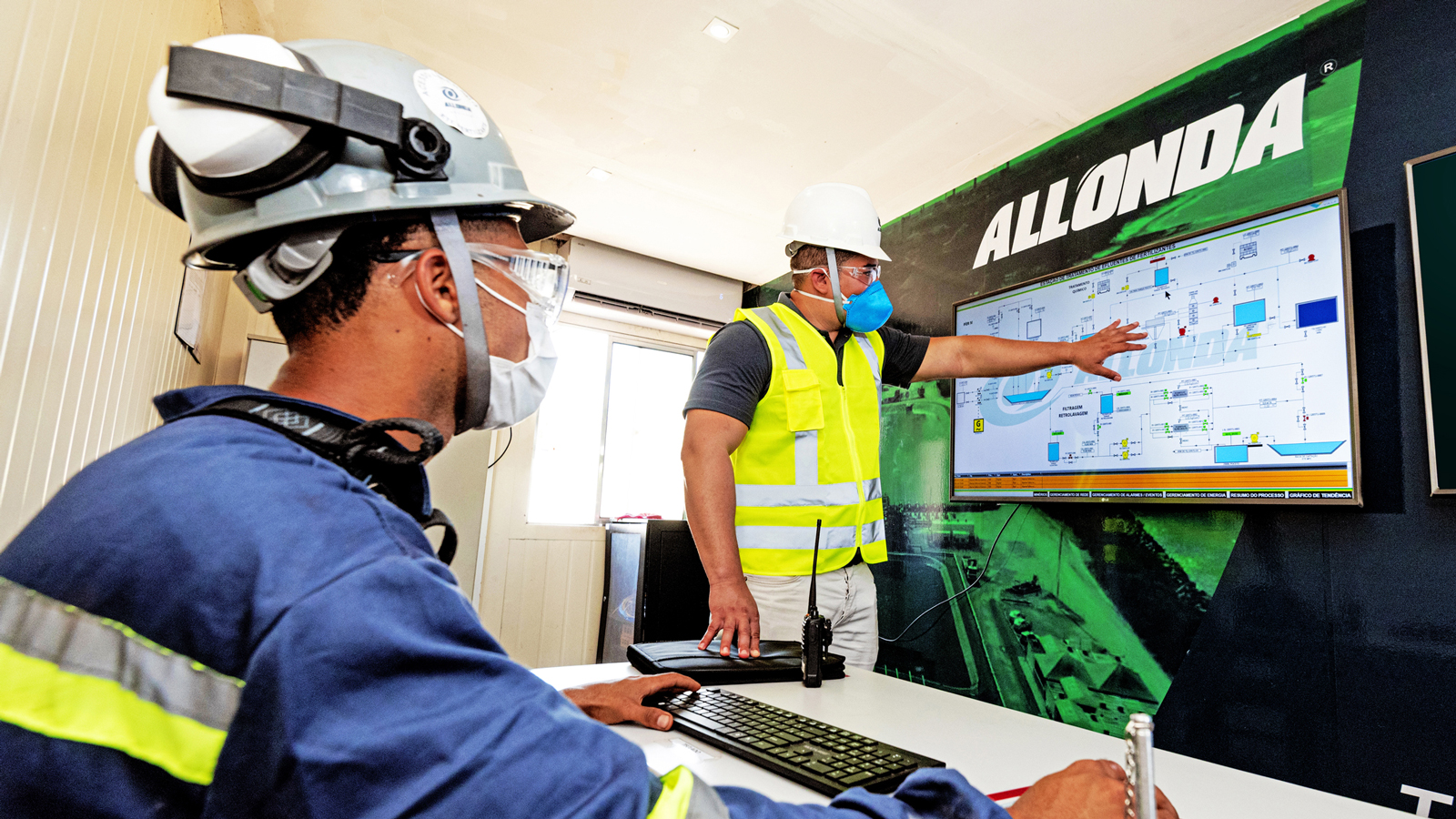
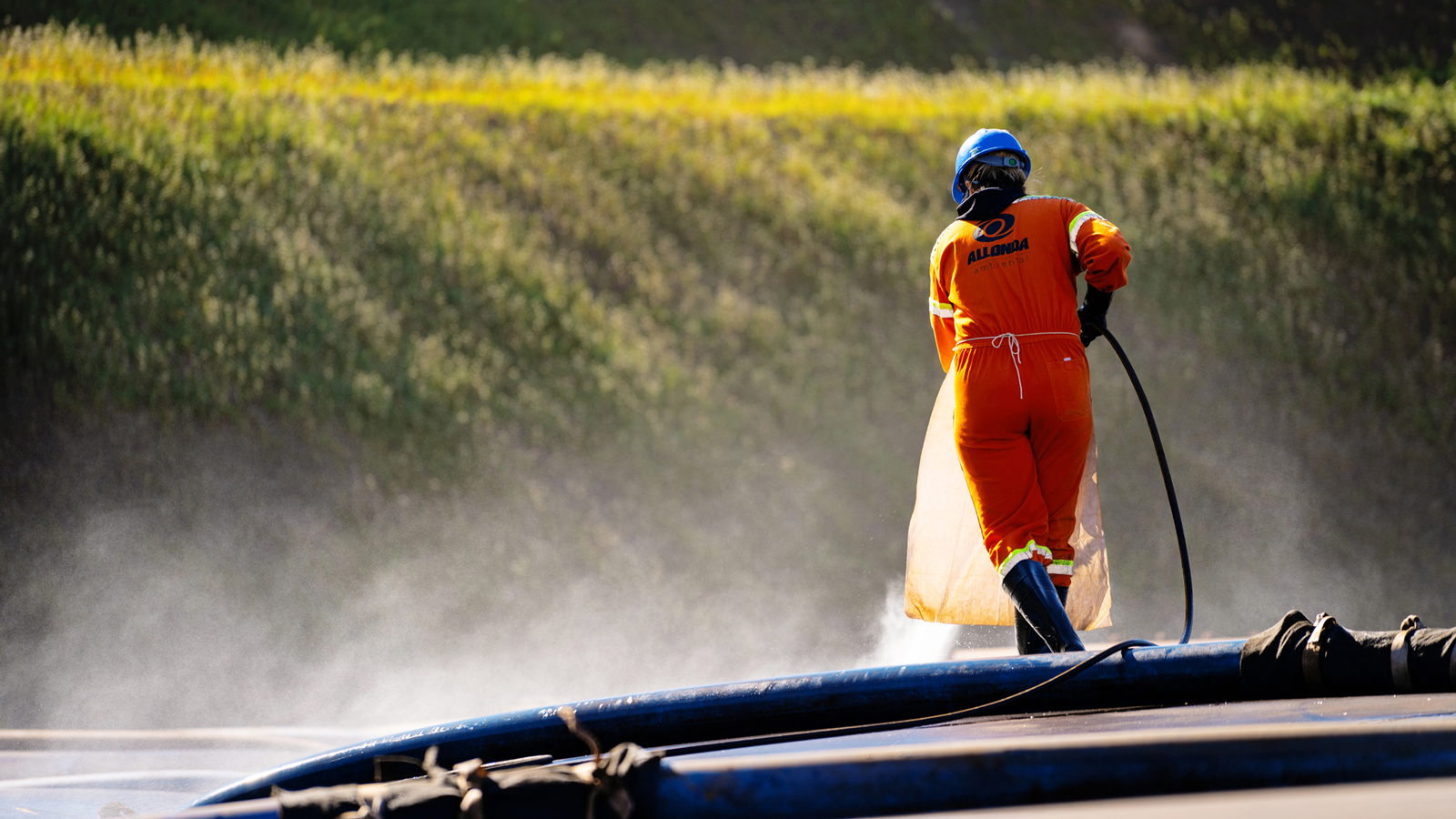
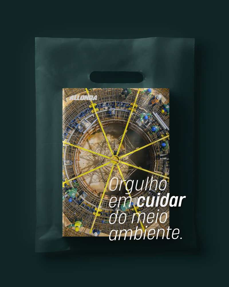
In the system, the oval shape of the symbol takes center stage, being applied in different ways, from lines to gradients and photos. Its new treatment opens possibilities, projects energy, and inspires confidence while reinforcing Allonda’s individuality. As part of the identity, we have also developed a warmer and closer photography style guide featuring the people who effectively participate in this environmental transformation.